Thursday, 7 April 2011
Thursday, 3 March 2011
audience feed back
questionnaire
do you think my magazine meets the target audience?
100% said yes
what do you think about my front cover?
most of my feed back was that the colours went really well for a rock magazine and the image really stands out hower a couple of peope said they dont like the colours al togeather
what dont you like about my front cover?
many people said the colours dont stand out enough and some of them dont match
how can it be improved?
90% of people said to make the title stand out more
what do you like about my contents page?
100% of people said the lay out was realy good as it was easy to follow
what dont you like about my contents page?
many people said were i have put a smaller image of my front cover it does not go and also there isnt alot of information
how can it be improved?
many people said they would prefare it if there was more colour
what do you like about my double page spred?
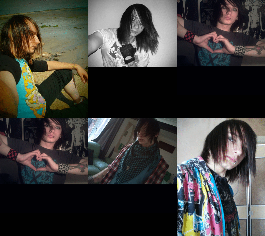
all of the paople said they like the image as it stands out and looks masterious
what dont you like in my double page spred?
many people said that the title looks to plain and so does the right hand side
what can be improved?
every one said more text
Question four
Who would be the audience for your media product?
name - naiomi
gender - female
age - 16
music - scence / emo eg black veil brides
style - rock / scence
Name – Darren
Gender – male
Age – 19
Music – rock e.g. all time low and bring me the horizon
Style – rock / scene
Name – beth
Gender - female
age - 18
music - rock eg you me at six
style - rock
Thursday, 27 January 2011
Wednesday, 19 January 2011
contents page
screen shots of contents page
first i added the background and the title
then i put one of the images on
then i added more pictures
i then changed the layout
i then added an image of my front cover
i then added my title
i then added my images
first i added the background and the title
then i added the writing
then i added more pictures
i then changed the layout
i then added an image of my front cover
i then added my title
i then added my images
Monday, 10 January 2011
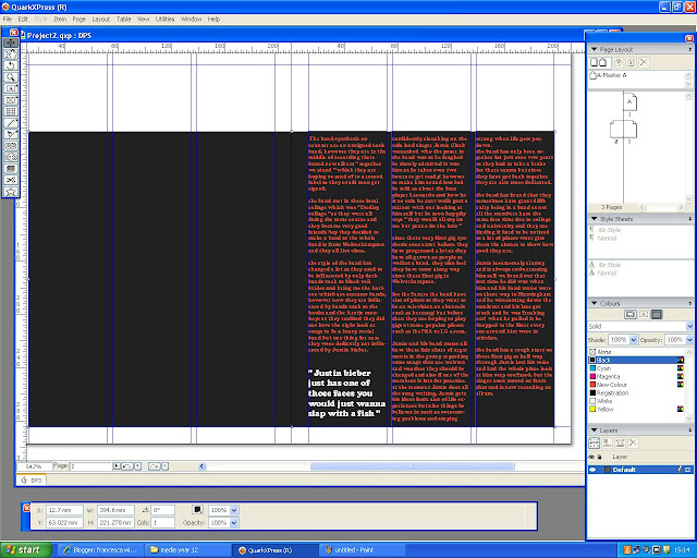
screenshots of double page spred
for my dps i first added the background and article
i then added the picture of the singer
i then added the title
then i moved the picture so it was behind the first collum of text
then i changed the colour of the writing and moved my quote
i then moved the title to one page and made the image larger
screen shots of front cover
in lesson we started to make are front cover and took screen shots of it.
1. i added a black background
2. i added the title and made the font look more original
3. then i added the first cover line
4. i then added the main storyline
5. then i added the smaller cover lines with the bar code and price
6. then i did the plus section
7. then i added the positioning statement
8. then i changed the background colour to a black grey and white
9. i then changed the colour of the title to purple
10. the plus sectoin at the bottom was kept the same
11. i then changed the main image
12. i then began to add the cover lines
13. i then added the main storyline
Subscribe to:
Posts (Atom)


+copy.jpg)


