in lesson i converted my results into power point
this is my questionnair results put into a powerpoint
please click the link below
http://www.slideshare.net/francescaxx/powerpoint-results-5827166
Wednesday, 20 October 2010
my questionnaire
in lesson i was told to create a questionnaire in order to help me make my rock magazine so i new what my target audience is looking for.
codes and conventions of a double page spred
in lesson we looked at the codes and conventions of music mags double page spread we found that:
these are two examples:
- main image takes up a page
- main title/ head lines - bold - unique - short - stands out
- stand first, small into to article, above article
- in 3-4 columns
- by-lines/credits the photographer and writer
- most of the images look at the camera but not necessary
- drop quotes made larger
- font-small-size 11
- lots of righting
- artists name high lighted so it stands out
- image mainly on right
- simple and consistent colours that match image so that it is - pleasing - organised - stands out and attracts the audience
- page number - name of mag and web address bottom corner
- informal mode of address gets the audience to connect to it and gets them to relax when reading it
these are two examples:
contence page on prezi
in lesson we made analised a contents page on prezi to see this please click on the link below
contents page
contents page
Wednesday, 13 October 2010
this is my analysis of a rock mag front cover
in lesson i analised rock sound so that i could see the different things professional magazines had on them to help me whith my magazine.
this is my analysis of a rock mag front cover
in lesson i analtised kerrang so that i could see the different things professional magazines had on them to help me whith my magazine.
initial plans 2
using the results that i got from my research i have decided that my magazine will be:
price - £2.50
frequency of publication - every Friday
average issue size - 60 pages
regular contents - gig list
feature articles - interviews and gigs
price - £2.50
frequency of publication - every Friday
average issue size - 60 pages
regular contents - gig list
feature articles - interviews and gigs
Monday, 11 October 2010
reserch on music mags
the mags that i have researched are the same genre as the one i am planning to do.
price- £2.20
frequency- every Wednesday
issue- 60 pages
feature articles- interview with bands
website - www.kerrang.com
publisher - Bauer
editor - Nichole Browne
the second mag i looked at was rock sound
price- £3.50
frequency- monthly
issue- 50 pages
feature articles- interview with bands
website - www.rocksound.com
editor - Darren Taylor
the third mag i looked at was classic rock
price-£3.00
frequency- monthly
issue- 50 pages
feature articles- interview with bands
website - www.classicrock.com
publisher - Scott Rowley
editor - future publishing
inital idea of music mag
I have decided to do a rock music mag, which will be aimed at teenagers between the ages of 15-19 and it will be for male and females. i have decided to do this genre of mag from looking at mags such as kerrang.
evaluation of school mag
My school magazine front cover follows forms and conventions of other existing magazines. This is shown in a couple of ways such as the font size which is size 11 which is the standard size for smaller cover lines. Also the main title has a different colour box around it so the title is separated from the rest of the magazine and it is also in capitals and bold. None of the cover lines cover the main images face and and the main cover title is bigger then the rest also it is bold with smaller writing under neath to tell you more about the story also the back ground is plain and it sticks to a simple colour scheme.
my contents page follows the forms and conventions as it is in three columns which have feature articles and regular articles and the main story has the biggest image to show its the main thing in the magazine. also the numbers come before the text.
my school magazine front cover does not follow the forms and conventions as the main title looks very dull and it does not stand out very much. there are not many cover lines which makes the magazine front cover look boring and empty.
my school magazine contents page doesn't follow the forms and conventions as the colour scheme is different to the front cover and it is very empty as there are not many cover lines and it looks boring. and the lay out is all over the place.
the technology's that i used was quark this was a new software i used to make my contents page and i also developed my photo shop skills when i was making my front cover.
Monday, 4 October 2010
front cover of school mag
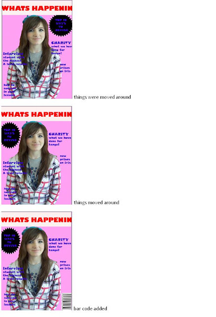
today in the lesson we carried on creating are front covers for are mags and began to take screen shots to show what we are doing and what its started as to what it finishes like.
Sunday, 3 October 2010
school mag
in lesson we had to draw out are front cover and contence page so that we could deside what we were going to put as are story lines and are images. in the next lesson we all went out and started to take are pictures and create are front covers on photoshop.
Subscribe to:
Comments (Atom)


